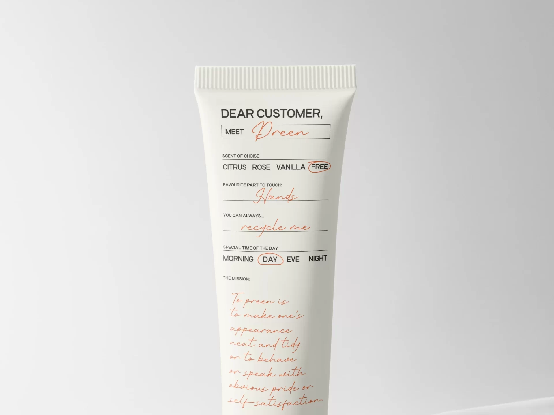
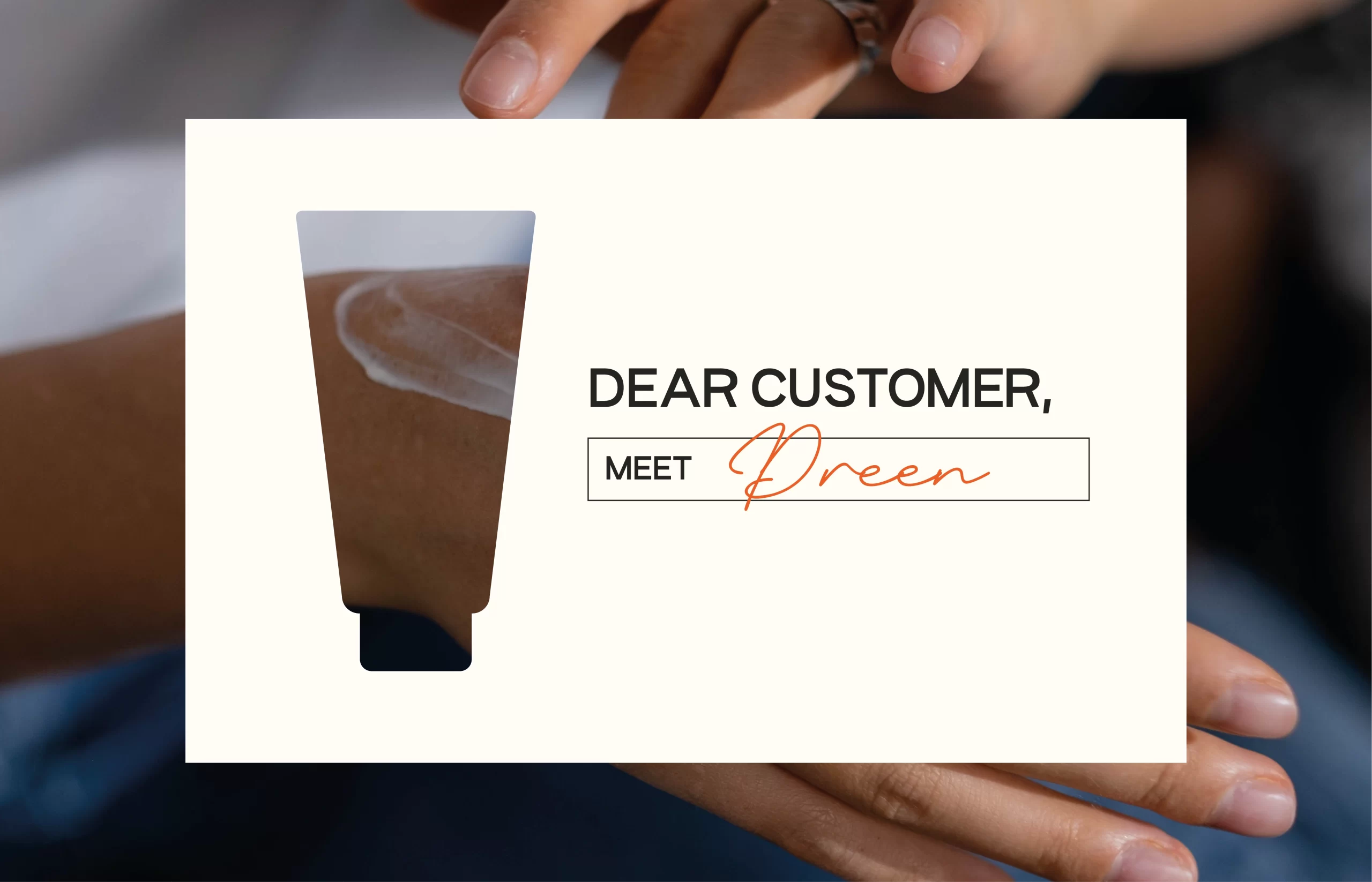
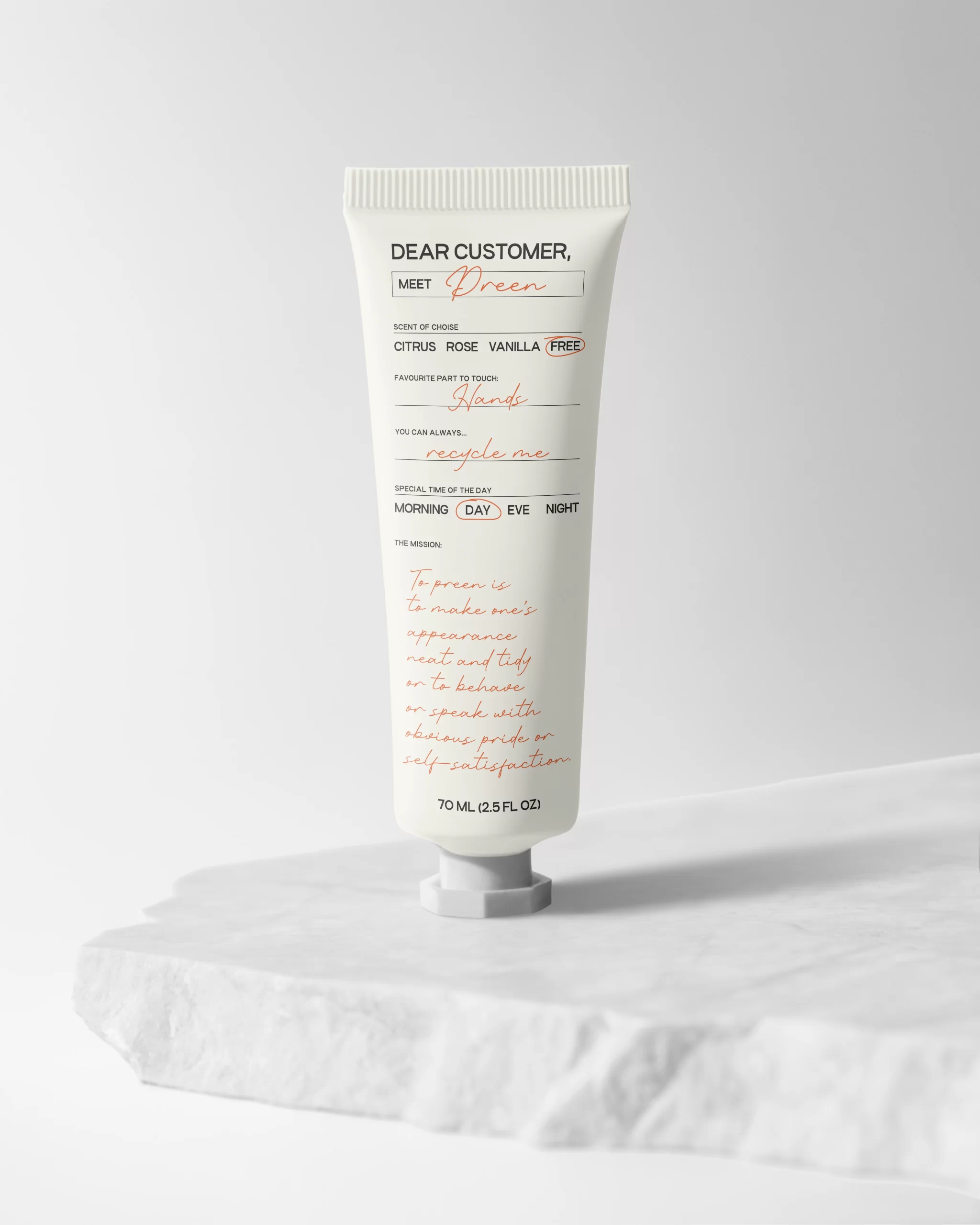
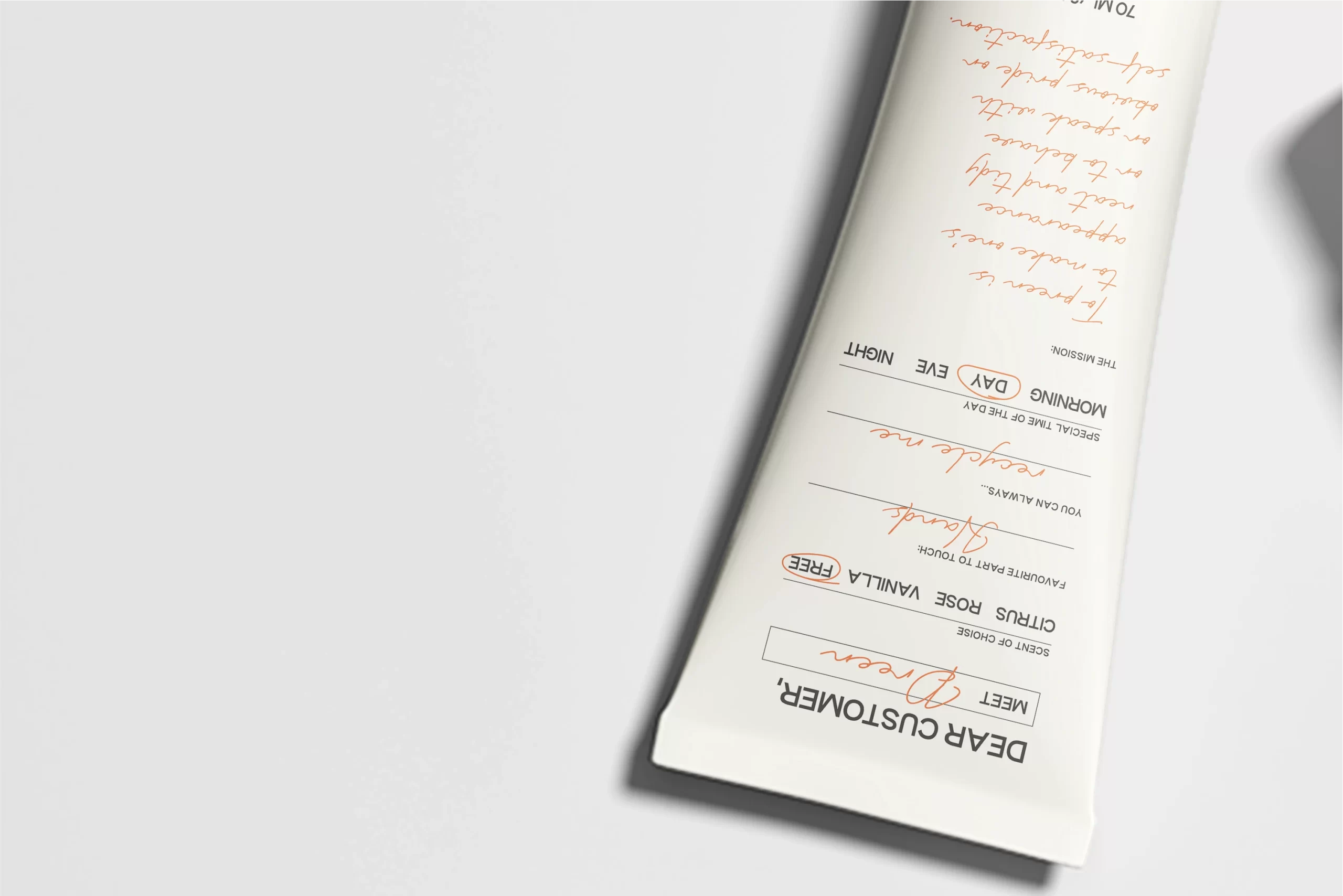
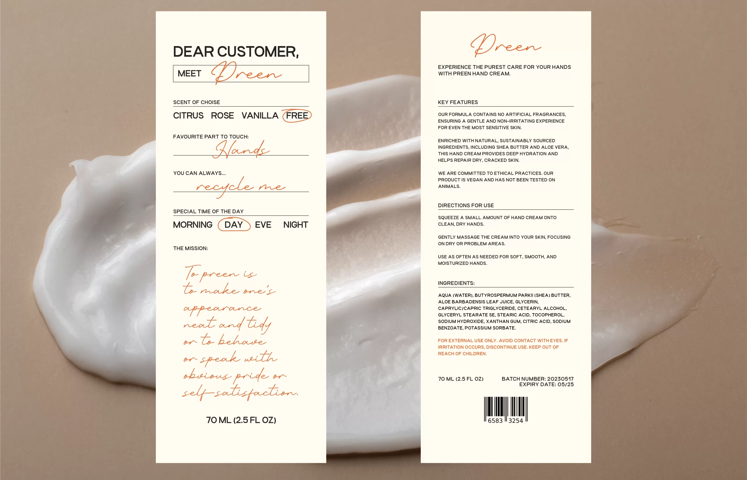
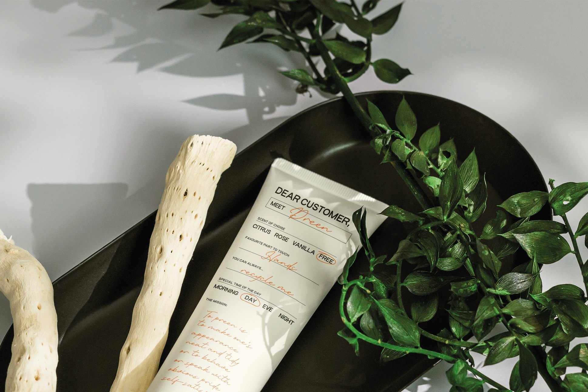
Preen

Our design agency collaborated with Preen, to create an exceptional packaging design for their latest product — a hand cream. The objective of this project was to craft a packaging solution that not only reflected the brand’s values but also conveyed the essence of the product itself.

Task

Our task was to ensure that the packaging design captured the essence of this product while maintaining the brand's aesthetic.

  • Design

    Graphic Design, Packaging, Branding

⬤ 01. Challenges

Brand alignment.

Preen is a brand known for its commitment to quality and innovation in the beauty and skincare industry. With a loyal customer base and a reputation for excellence, Preen sought to introduce a new hand cream to their skincare lineup.

The first and foremost challenge was to align the packaging design with Preen’s existing brand identity. We needed to ensure that the design spoke the language of elegance, sophistication, and trust that Preen was known for.

⬤ 02. Experience

Product essence.

Hand creams are often associated with qualities such as softness, moisture, and rejuvenation. Our task was to visually convey these attributes through the packaging. We needed to create a design that immediately communicated the product’s purpose and benefits.

In a crowded market, it was crucial to make the Preen hand cream packaging stand out. We aimed to create a design that was both unique and memorable, making it easy for consumers to identify on the shelf.

⬤ 03. Wider view

Exploring the product.

Ready to get the most
out of digital?
Let's get in touch!

Contact us now and let's get started!

Leave a Reply

Ваш адрес email не будет опубликован. Обязательные поля помечены *

This website stores cookies on your computer. Cookie Policy