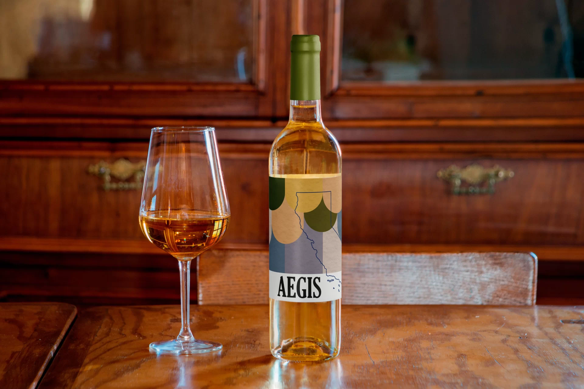
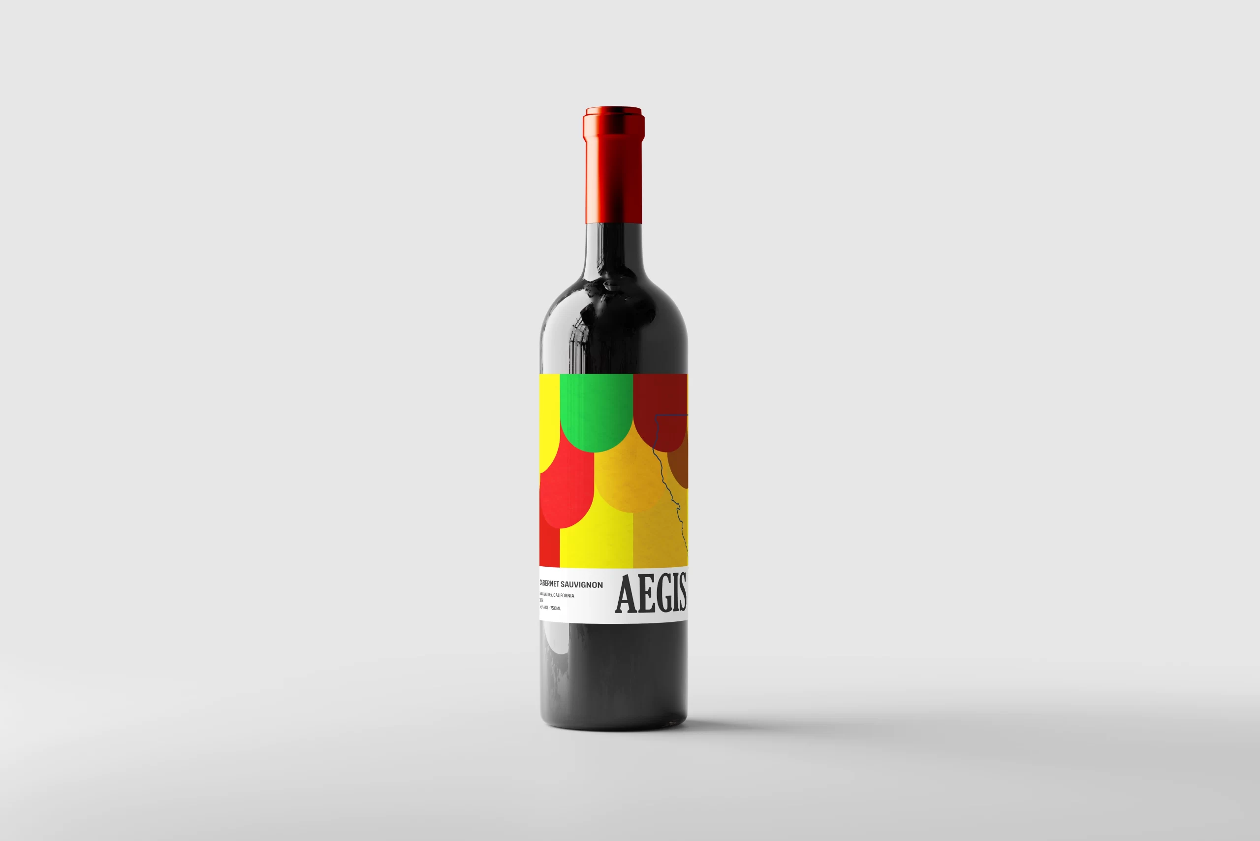
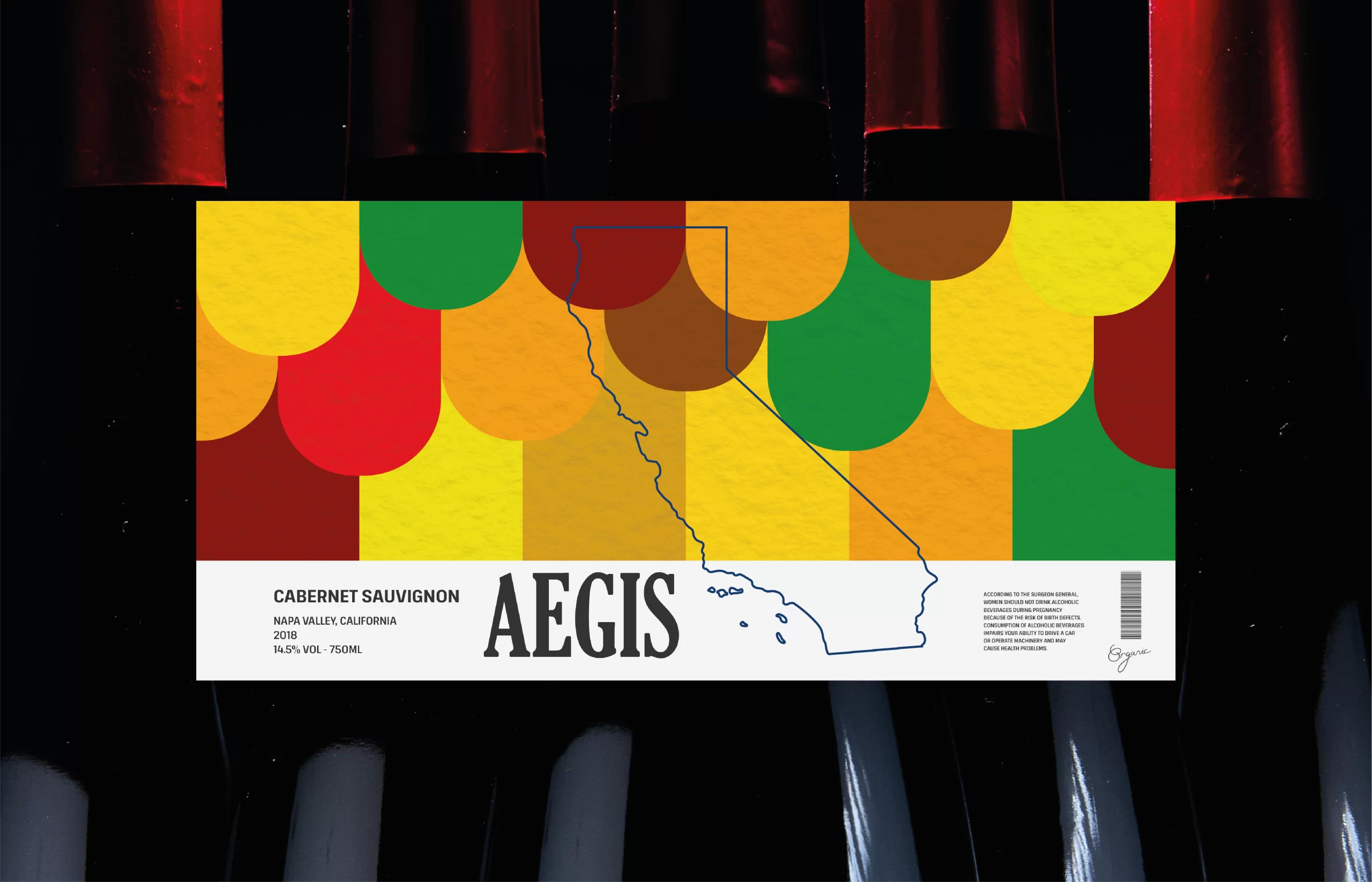
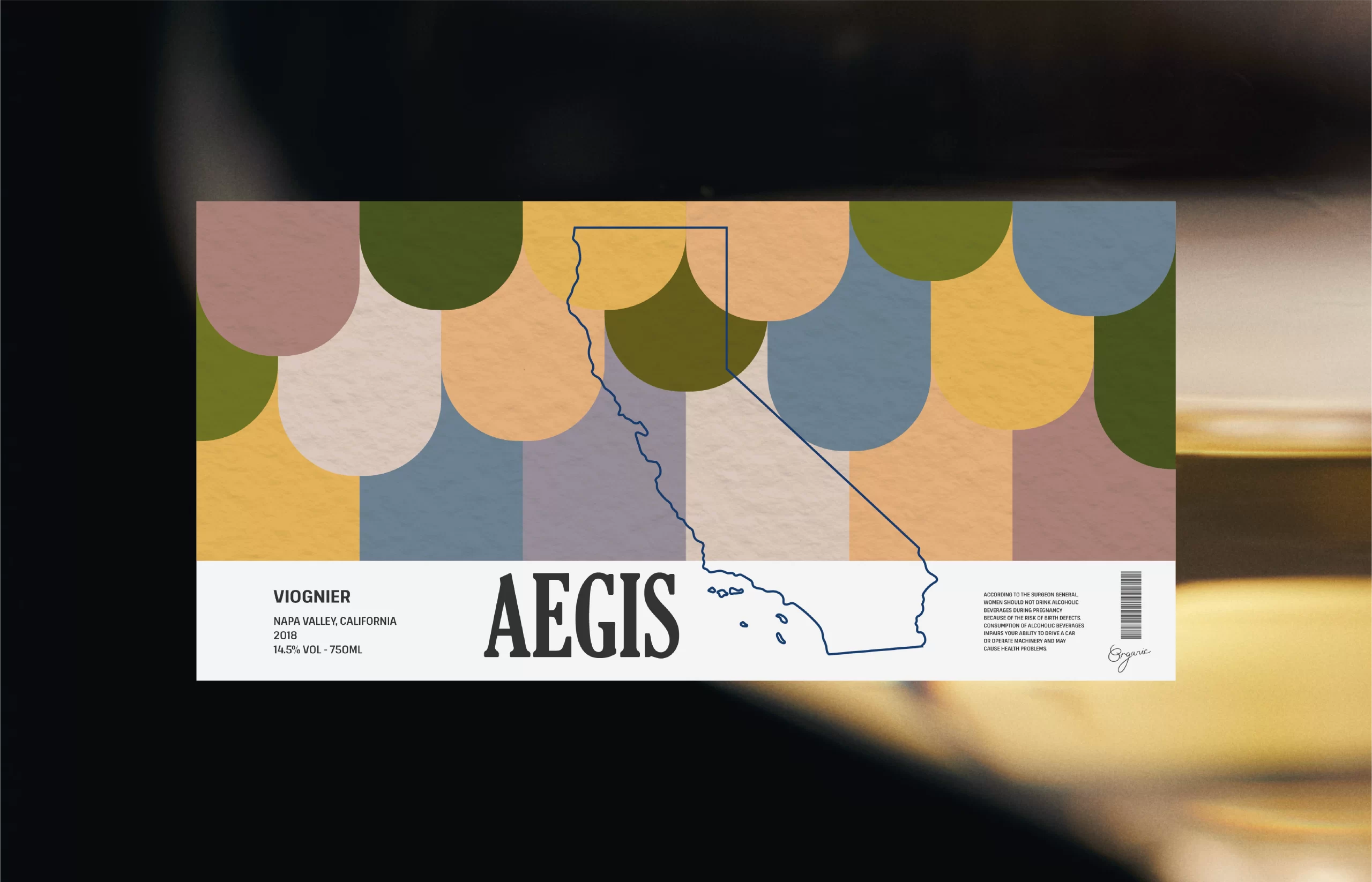
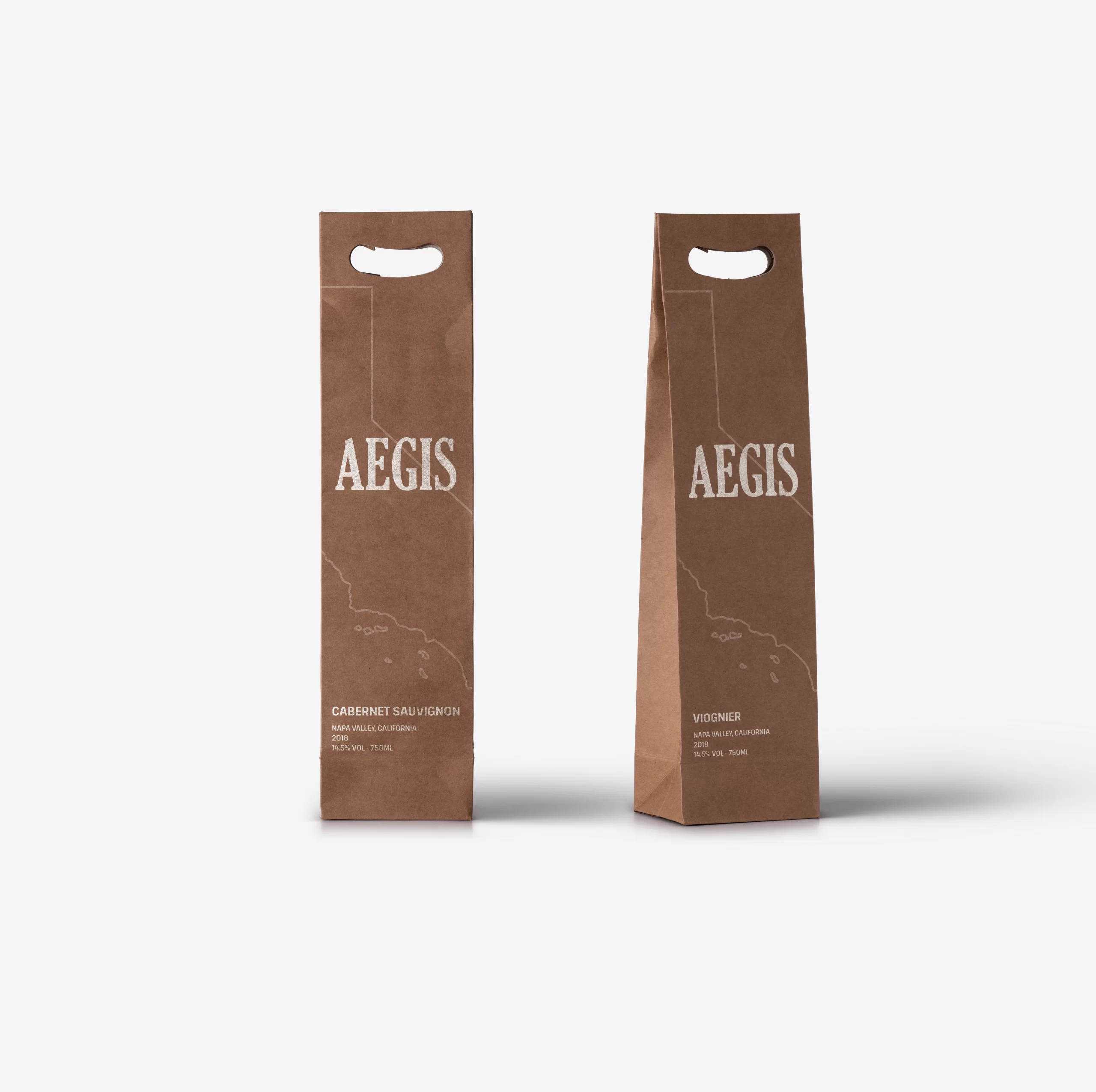
AEGIS

We’ve been working on a unique and visually captivating packaging design for the esteemed wine brand, AEGIS. They produce a selection of wines that are not only known for their exceptional quality but also for their embodiment of the rich cultural heritage and stunning natural beauty.

Task

The task at hand was to craft a label design that not only showcased the wines produced by AEGIS but also paid homage to the vibrant and lush environment of the vineyard

  • Design

    Graphic Design, Packaging, Branding

⬤ 01. Challenges

Incorporating natural elements.

We aimed to develop a distinct visual identity for AEGIS wines, ensuring that their products would stand out on the shelves and attract wine enthusiasts. This involved crafting a unique design that would become instantly recognizable as AEGIS.

The label design relied heavily on graphics inspired by the scenic beauty of the vineyard. To capture the rich, earthy tones of the winery, we carefully selected a color palette that reflected the warm and inviting atmosphere. 

⬤ 02. Experience

Conceptualization.

We studied the region’s geography, viticulture, and the unique characteristics that set AEGIS apart, to understand the winery’s essence and how we could translate it into a visual narrative.

The inspiration drawn from the vineyards, rolling hills, and the play of light and shadow on the grapevines helped shape the core concept of our design.

⬤ 03. Wider view

Exploring the product.

Ready to get the most
out of digital?
Let's get in touch!

Contact us now and let's get started!

Leave a Reply

Ваш адрес email не будет опубликован. Обязательные поля помечены *

This website stores cookies on your computer. Cookie Policy